Layout and styling
Use the Styling panel to adjust how a selected field or its group is arranged and displayed. Styling changes affect presentation; use Field Edit for labels, values, and validation.
Select a field
Section titled “Select a field”- Select a field in the canvas or Fields panel.
- Open Styling in the sidebar.
- Choose Self to style the selected field.
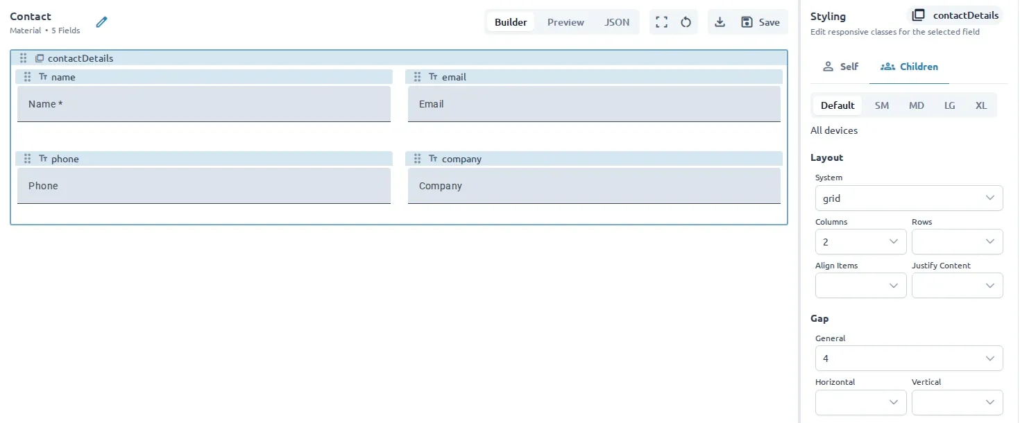
- If the field contains other fields, choose Children to adjust its group layout.
The Children tab is available for container fields such as groups and repeaters.
Style the selected field
Section titled “Style the selected field”For the selected field, the styling configuration provides controls for:
- Layout and column placement.
- Width and height.
- Margins and spacing around the field.
- Responsive variations for different screen sizes.
- Additional CSS class names when direct class control is needed.
The exact options depend on the configured styling system, which defaults to TailwindCSS. Use the controls to preview the change in the canvas, then switch to Preview to see the form without editing controls.
Style a field group
Section titled “Style a field group”For a container field, open Children to control the arrangement of its contents. Depending on the configured styling system, you can choose:
- A layout system such as flex, grid, or block.
- The direction of a flex layout.
- The number of grid columns or rows.
- Alignment and justification.
- Gaps and padding between or around children.
Use group styling to create a readable layout without changing the fields themselves.
Keep styling maintainable
Section titled “Keep styling maintainable”Start with the default layout and make small changes. Prefer field and group layout controls over adding many custom class names, especially when the form should work across screen sizes.
Use Structure fields to build sections and repeating layouts, then Preview and test the result.