Add custom components
Start with the App Material profile from Configure a UI profile. This example adds the existing Studio postal-code component. Use the same steps for your own registered Formly type; component implementation remains ordinary ngx-formly code.
1. Register the runtime type
Section titled “1. Register the runtime type”Replace the profile’s runtime factory with:
import { withPostalCodeType } from '@formly-editor/material';import { materialConfigOptions } from '../material/material.config';
export function appMaterialConfigOptions() {  return [...materialConfigOptions(), withPostalCodeType()];}
withPostalCodeType() registers postal-code, its Material form-field wrapper, and validation
messages. The Material configuration supplies that wrapper’s implementation.
For your own component, supply a Formly ConfigOption with a named type registration:
{ types: [{ name: 'your-type', component: YourFieldType }] }. Named types allow saved JSON to
refer to components without containing Angular classes. See Formly’s
custom types guide for component authoring.
2. Expose the type and its properties
Section titled “2. Expose the type and its properties”Replace the catalog alias with a composed catalog:
import { createInputProperty, FieldTypeOption } from '@formly-editor/core';import {  formFieldWrapperOptions,  keyProp,  labelProp,  materialFieldCategoryOptions,  requiredProp,} from '../material/material.options';
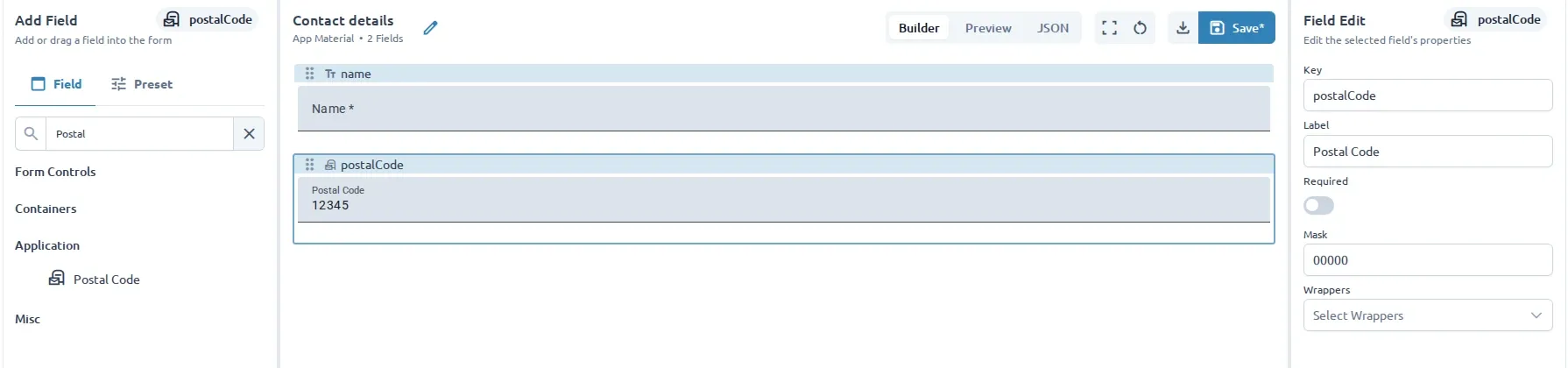
const postalCodeTypeOption: FieldTypeOption = {  name: 'postal-code',  displayName: 'Postal Code',  materialSymbol: 'local_post_office',  keyGenerationPrefix: 'postal',  defaultConfig: {    props: { label: 'Postal Code', mask: '00000', inputMode: 'numeric' },  },  wrapperOptions: formFieldWrapperOptions,  properties: [    keyProp,    labelProp,    requiredProp,    createInputProperty({ label: 'Mask', key: 'props.mask', dataType: 'text' }),  ],};
export const appMaterialFieldCategoryOptions = [  ...materialFieldCategoryOptions,  { displayName: 'Application', children: [postalCodeTypeOption] },];
The metadata name must match the runtime type. defaultConfig supplies inserted-field defaults;
the property key props.mask identifies the value edited in the field configuration. The component
must actually consume that property. This compact example exposes only a subset of the component’s
options; use the
full Studio metadata
for boolean, select, validation, and preset examples.
3. Exercise it in a template
Section titled “3. Exercise it in a template”Add this field to the Contact details template:
{ key: 'postalCode', type: 'postal-code', props: { label: 'Postal Code', mask: '00000', inputMode: 'numeric' },}Create a new form from the template. Existing saved forms do not acquire later template changes. Edit Mask, then check Preview, model values, validation, JSON, and export/reimport.
Wrappers and containers
Section titled “Wrappers and containers”Wrappers need runtime registration and a matching FieldWrapperOption on the field type’s
wrapperOptions. Supply a user-facing label and properties for values the wrapper consumes.
Wrapper metadata alone does not apply a wrapper: use runtime type defaults or the field’s
wrappers array. Do not reuse a Material wrapper for a different UI library without checking its
dependencies. See Formly’s custom wrappers.
For groups, use isParent: true with fieldGroup; repeaters also use isFieldArray: true with
fieldArray. Follow Studio’s card and repeating-section examples rather than maintaining a second
editor state model.
Tabs and steppers need special authoring behavior in Studio. Their builderConfigOptions use
adapters from @formly-editor/builder-material; configOptions retain the real runtime components
for Preview. Simple fields such as postal code do not need a builder override.
Runtime portability and checks
Section titled “Runtime portability and checks”Register custom validators and messages in runtime configuration too. Link their named references from fields, and expose the relevant editor properties. Use JSON-compatible options and string expressions for portable examples. JSON is not a bundle of functions, hooks, services, or components; your consuming application must supply the same runtime dependencies. See Formly’s validation and expressions guides.
| Symptom | Check |
|---|---|
| Type renders but is missing from the palette | Add it to the active profile’s field catalog. |
| Unknown type or wrapper | Match names and check runtime registrations. |
| A property edit has no effect | Check the property path and the component’s supported props. |
| Preview works but the exported form fails | Register the same types, wrappers, validators, services, and styles in the consuming app. |
Adapt the existing
Studio profile tests
and integration tests.
Check catalog/runtime names, defaults, wrapper compatibility, template libraryId, property edits,
profile switching, and exported fields without editor _info metadata. Run npm run test:studio
and npm run build:studio; also run the affected library suite if you change a reusable component.
Finally, render the exported form in your Angular application.