Add and configure fields
Open a form in Builder mode. The form’s UI library determines which fields and settings are available and cannot be changed after the form is created.
Add a field
Section titled “Add a field”- Open Add Field in the sidebar.
- Select Field.
- Find a field under Basic Fields, or filter the list.
- Drag the field onto the canvas.
The field appears on the canvas and in the Fields panel. Select it in either place to open its settings in Field Edit.
Set its identity and text
Section titled “Set its identity and text”Start with the properties that identify the value and explain it to users:
- Key identifies the value in the form model. Use a unique, descriptive key such as
email. - Label names the field.
- Placeholder provides a hint inside an empty control.
- Description adds supporting text.
- Default Value sets the initial value.
- Hide and Readonly, when available, control visibility and editing.
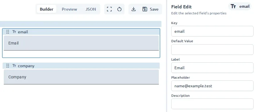
The form name, field label, and field key serve different purposes. The form name identifies the document in Workspace, the label is visible to users, and the key identifies the stored value.
Configure the field type
Section titled “Configure the field type”Field Edit shows settings supported by the selected field and UI library. Common examples include:
- Input mode for email, password, telephone, URL, or numeric input
- Minimum and maximum values for numbers
- Rows and automatic sizing for text areas
- Calendar behavior for dates
- Label position and initial state for checkboxes and toggles
See UI Libraries for the exact fields and properties available in each library.
Configure choices
Section titled “Configure choices”For Select, Radio, and Multi Checkbox fields:
- Find Options in Field Edit.
- Add an option.
- Enter the label shown to users and the value stored in the model.
- Repeat for each choice.
Enable Multiple Selections on a Select field when users may choose more than one value.
Add validation
Section titled “Add validation”Use the validation controls available for the field:
- Required prevents an empty value.
- Min Length and Max Length constrain text length.
- Min and Max constrain numeric values.
- Pattern requires a specific format.
Write validation messages that tell users how to correct the value. Test each rule in Preview.
Use a field preset
Section titled “Use a field preset”A preset adds one preconfigured field to an existing form. This differs from a template, which creates a new form with an initial structure.
To create a preset from a configured field:
- Select the field in the Fields panel or on the canvas.
- Open Options.
- Select Save as Preset.
Saving a field as a preset creates a reusable starting point without changing the current field.
To use a preset:
- Open Add and select Preset.
- Find a preset or filter the list.
- Drag it onto the canvas.
- Select the new field to review its key, text, and validation.
Preset availability depends on the form’s UI library. For example, Material includes an Email preset, while Studio Material includes US ZIP Code and Canada Postal Code presets. The editor’s Preset list is the authoritative list for the active library.
Use Structure fields for groups and repeating sections, or Layout and styling to change presentation.